Designing a Collection Around Quietness
There’s a strange pressure online to make everything louder.
Louder colors. Louder messaging. Bigger graphics. More products. More text. More urgency. More reasons someone absolutely must buy something immediately before the internet collapses or whatever we’re pretending is happening this week. While creating the Monarch Collections, I found myself moving in the opposite direction instead.
I wanted the collection to feel quiet.
Not empty or minimal for the sake of trend aesthetics, but calm. Thoughtful. Spacious. I wanted the artwork to breathe rather than compete with oversized typography, decorative elements, or overly busy layouts. The more I worked on the collection, the more I realized restraint itself was becoming part of the design language.
Maybe that instinct comes from my own life, too. After enough seasons of rebuilding, adapting, caregiving, and constantly navigating noise from every direction, I’ve found myself drawn more and more toward quiet things. Slower things. Work that leaves room to breathe.
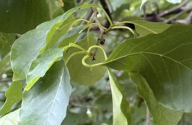
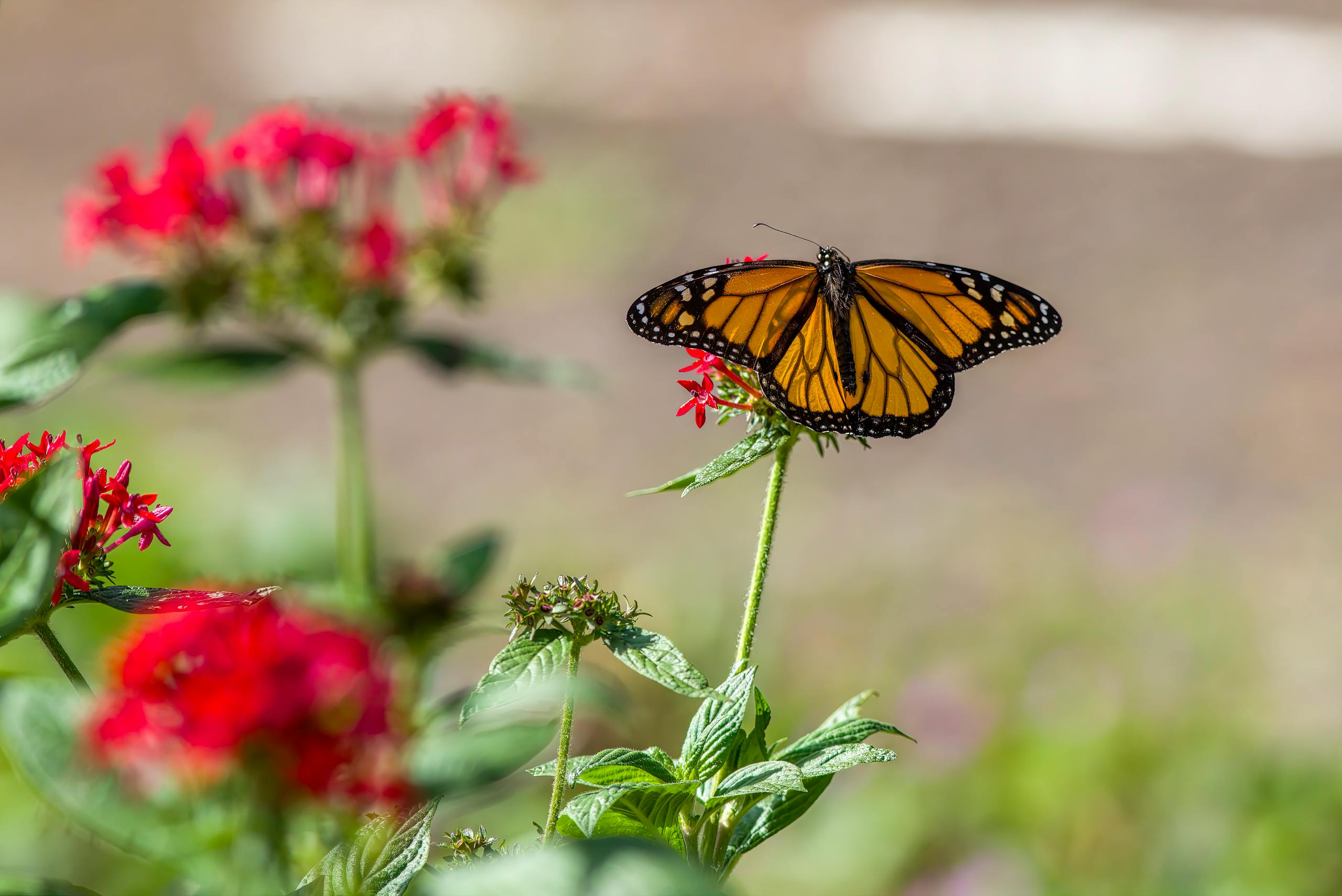
The butterfly illustrations already carried a lot of emotional weight visually, especially once I began developing different colorways. The orange monarch felt rooted in wandering, movement, and endurance. The green monarch shifted into something softer and more woodland-inspired. Because the artwork itself already carried atmosphere, the typography didn’t need to shout over it.
That realization shaped everything that followed.
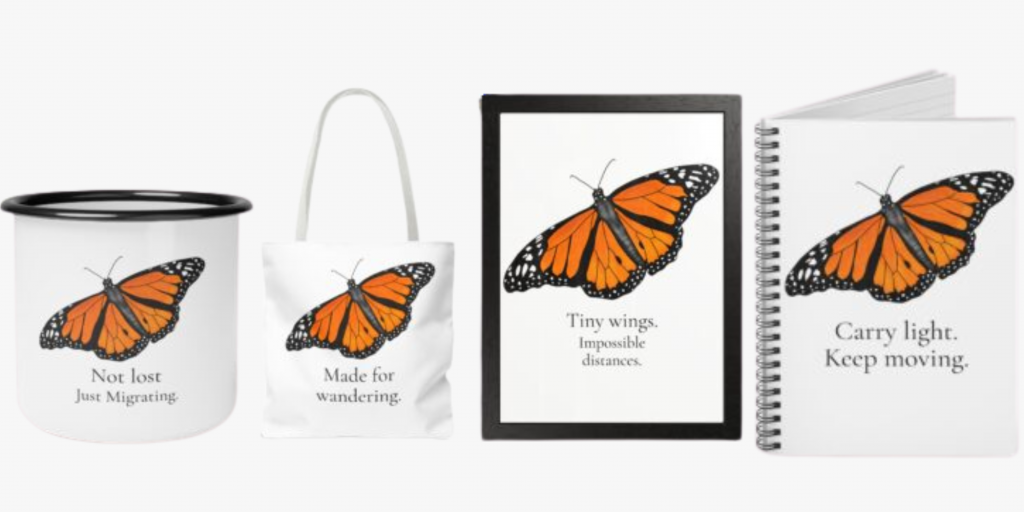
The phrases became shorter. Simpler. More reflective. Instead of turning the products into loud, inspirational pieces, I wanted them to feel more like quiet observations someone might stumble across in a trail journal or in the margins of a well-used notebook.
“Wander gently.”
“Carry light. Keep moving.”
“Wild things find their way.”
None of them feels like commands to me. They feel more like reminders.
I also intentionally left a lot of negative space throughout the designs. White space often gets treated like unfinished space, but I’ve always loved the calmness it creates when used intentionally. It gives the artwork room to exist without pressure. It slows the eye down a little. In a collection centered around wandering, instinct, and quiet movement, that felt important.
I think creating this collection also reflects where I currently am creatively. Over the last year, I’ve found myself moving away from overcomplication and toward work that feels more grounded and emotionally honest. I’m less interested in chasing trends and more interested in creating pieces that carry atmosphere, feeling, and a sense of stillness.
The Monarch Collections became an extension of that shift.
At their core, these products are simple objects: mugs, notebooks, totes, framed prints. But I wanted each one to feel intentional rather than over-designed. Something calming. Something quietly personal. Something that feels at home beside morning coffee, hiking trails, reading nooks, road trips, journals, and slow creative days.
In a world constantly asking us to be louder, there’s something meaningful about creating work that simply asks us to slow down and notice what already feels alive around us.